by Ydraw | Sep 26, 2018 | Creative Marketing, How to pick a video style, video, Video Marketing, Video Strategy Guide, video style
Let’s talk about style…
The style of your video sends a subconscious message to your viewers and lets them know that your company is professional, modern, playful, organized, credible, genuine or any other positive brand qualifier.
If you haven’t already noticed, here at Ydraw we produce many different video styles. Some clients come to us knowing what type of video style they want and others not knowing their options let alone the differences between them.
Rather than shoving you into a box you don’t fit in, we are here to help guide you in the right direction and determine what video style best fits your unique brand, message, audience and budget.
Here is just a quick glimpse of a few of our video styles:
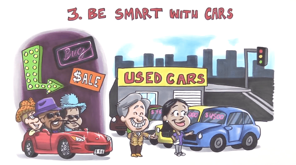
WHITEBOARD/BLACKBOARD/CARDBOARD:

Purpose: These videos are hand drawn with marker on the paper of your choice. The purpose is to create simple, relatable and easy to understand stories/concepts to explain your product or service. By lining up powerful narration and simple artwork we hit both sides of the brain to keep your audience interested and wanting to know more. These videos are our favorite for teaching.
Budget: Range from $ – $$
Features:
- Traditional artwork
- See the artists hand draw while narration is happening
- Small digital effects added in to bring on artwork or pose change a character’s expression etc.
- Hand drawn
- Funny and relatable
YSWIPE:

Purpose: This video style uses Pattern Interruption to change the viewers thoughts or perception and redirect their attention to what you want to show them. We use the artists hand to slide/snap/wipe/point artwork on/off screen to keep the video upbeat and lower the viewers defenses.
Budget: Range from $-$$$
Features:
- Traditional or digital artwork.
- Upbeat and fast moving
- Uses Pattern Interruption
- Artists hand slides/snaps/wipes/points artwork on screen.
YPAINT:

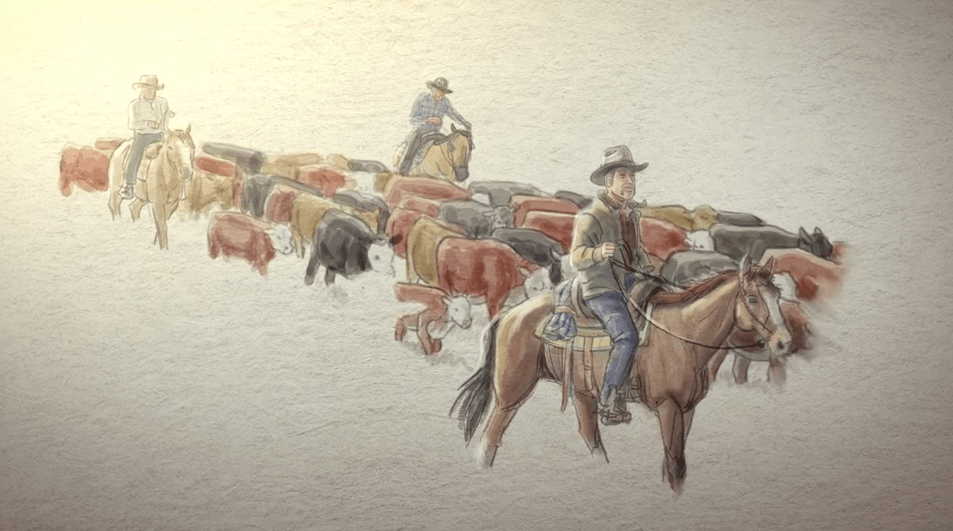
Purpose: Ypaint videos use full watercolor or pencil sketches and have a more realistic art style. Instead of seeing the artists hand, we digitally reveal the images as if they are being digitally painted or dropped on screen like a water droplet. These videos use slow movements and soft pastel colors to evoke emotion in the viewer. If you want your video to be inspirational, motivational and classy, this may just be the style for you.
Budget: $$
Features:
- Inspirational/Motivational/Classy
- Slower pace
- Soft Pastel Colors
- No hand involved
- Realistic artwork
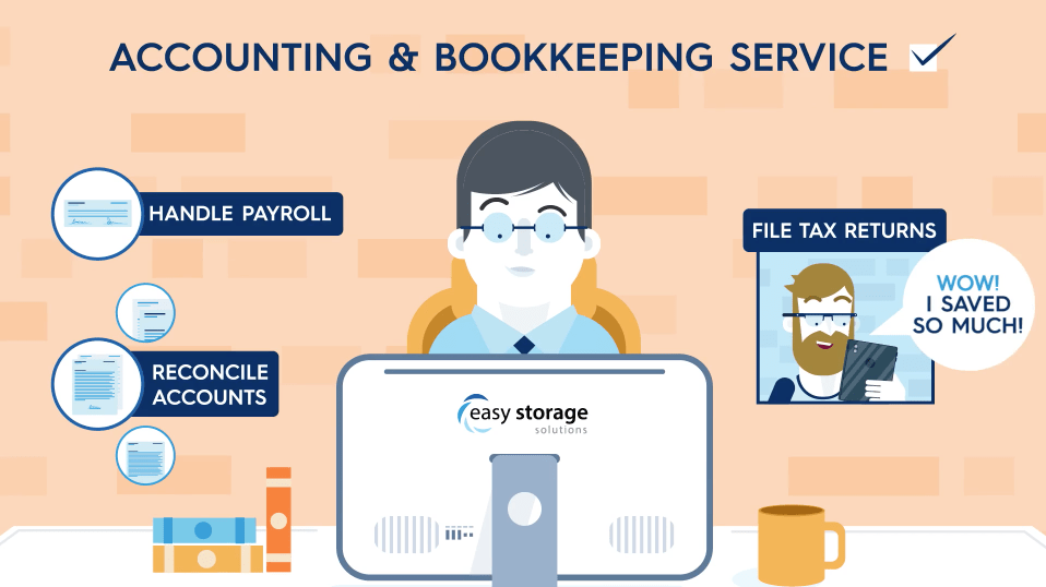
MOTION GRAPHICS:

Purpose: This video style uses simple digital artwork and kinetic typography to explain complex topics in a literal or abstract manner. Motion Graphic videos are fast moving and can allow a boring topic to be upbeat and easy to understand without telling a story or condensing information. Most of the time they are used to explain a complex product or show a result.
Budget: $$-$$$
Features:
- Pattern Interruption
- Lots of movement
- Simple digital artwork
- Exact brand colors
- More sophisticated
- Fast moving
- Can be literal or abstract
- Moveable characters and objects
ANIMATION OVERLAY:

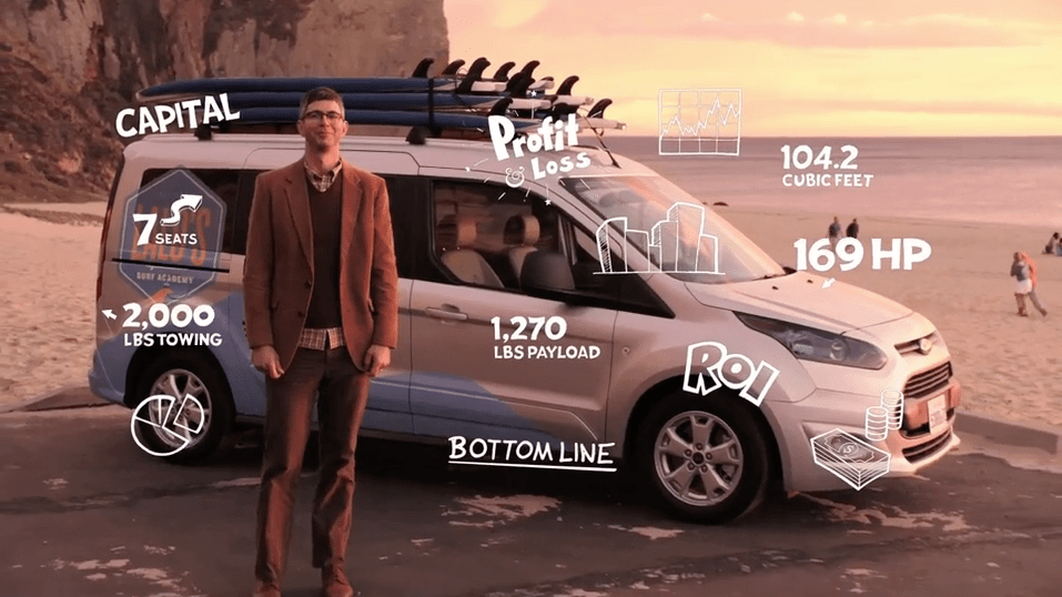
Purpose: This style overlays digital artwork on top of live video to make them more interactive and fun. Although we love using real people to evoke real emotion, sometimes it can get boring. If you want to show that your company is trustworthy by using live video as well as relatable and unique by using digital artwork, this style is for you!
Budget: $$-$$$$$ (Depending on price of live video). We are happy to do the live for you, or you can send us the live video and we can animate on top!
Features:
- Can be endorsed by celebrity in live video
- Trustworthy
- Sophisticated
- Interactive
- Allows viewers to go back and find a specific spot to rewatch.
- Combine real people and digital artwork
2D ANIMATION:

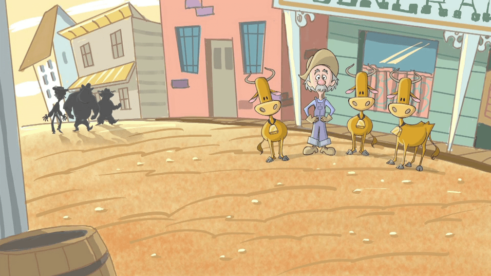
Purpose: This video style uses engaging narration and compelling characters and backgrounds to tell a story. Characters can range from simple stick figures to more complex and detailed characters. 2D animation allows the characters to move and talk more than you will see in a motion graphic video. Think cartoons like Tom and Jerry or Phineas and Ferb.
Budget: $$$-$$$$$
Features:
- Characters that talk and move more realistically
- Unique artwork that range from simple to complex
- Interactive and fun
3D ANIMATION:

Purpose: These videos use beautiful and complex three-dimensional characters and backgrounds to tell your story without using real people and places. The bigger the budget, the more complex artwork and movement. Think Toy Story or Tangled. The downfall to 3D Animation is that you are competing with companies like Pixar and Disney who have enormous budgets and endless amounts of time.
Budget: $$$$-$$$$$
Features:
- More bells and whistles than other video styles
- More sophisticated and complex
- Lots of movement
- Time consuming
- Characters can talk and move
- Digitally drawn artwork
So now that you know the basics, what video style is right for you?
What may have worked for one company may not work for yours. Depending on your purpose, audience, brand and budget there is a perfect style for your company and we are here to help you find it.
by Ydraw | Jul 26, 2018 | animated explainer video, animation, Animation Production, Animation Video, Creative Marketing, Explainer Video, explanation animation, How to pick a video style, Marketing, Motion Graphics, Video Marketing, video online marketing
So what are Motion Graphics and why should you use them? “Motion Graphics” is just a fancy term used to describe a mix between graphic design and animation. Most motion graphic videos you will see these days are purpose driven with the goal of presenting information to the viewer.
There are many reasons why you should choose to advertise or explain with Motion Graphics, the biggest reason being emotional response. Video creates an emotional connection with the person watching far quicker than any other content platform. Did you know that using video on your landing page could increase conversion rates by as much as 80%? Animated marketing videos in particular are a very useful tool to deliver your business idea in just a couple of seconds.
Another reason why Motion Graphics are the way to go is because it is perfect to explain a complex or abstract idea in a very simple, fast and compelling way. With an Internet attention span continuously decreasing this is a very valuable point to mention.
There are literally no limits when it comes to the creative aspect of Motion Graphics. You want a flying monkey in your video? Here’s a flying monkey. You want a man scuba diving off the coast of Bermuda with Great White Sharks? No problem the video can be created quickly and on a budget without the hassle of creating expensive sets and hiring film crews/actors.
Motion Graphics are extremely effective because we are all visual learners. People learn and understand much more efficiently when they are taught with the help of drawings, diagrams, charts and different designs.
If you are trying to determine how to create your next marketing video just remember, Motion Graphics is the way to go. There are literally no limits to what you can show with Motion Graphics. But more importantly, your audience will connect with the information or product you are presenting quickly and effectively.
Check out one our latest and greatest Motion Graphic videos below:
by Jace Vernon | Jun 13, 2018 | animated doodle videos, animated explainer video, Animated Whiteboard Videos, Animation Video, Art Style, Customer Service, How to pick a video style, How to pick an art style, quick draw video, scribble video, Training Videos, Whiteboard animation, Whiteboard Video

Everyone wants a viral video. In fact, that’s what most of our clients ask for when they come to us. But, when it’s time to look at our Art Styles page – many clients panic and think,
“What if I choose the wrong one?”
That’s why we are going to talk about the difference that art choice can make to your video and a few things to think about when choosing yours. Because although we pride ourselves on working with the most talented artists in the industry – that doesn’t mean that every one of them is the best choice for your project.
Let me tell you a short story.
Once upon a time, a client named Booz Allen came to us for their first whiteboard animation video. They are a serious, respected firm with very serious, important clients. Even though this video was internal, they wanted it to be serious, professional, and aspirational.
But, there was just one thing.
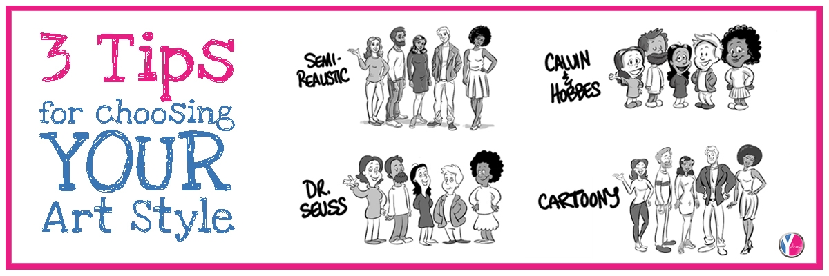
Their Scriptwriter had a gut instinct – what if we juxtaposed the informational tone of the script with a fun, unexpected art style like Calvin & Hobbes to create a surprise effect?
Well, Booz Allen decided to go with Semi-Realistic instead. Here’s the first scene from the first set of images delivered by their choice of artist:

This works. It gets the job done. However, Booz Allen isn’t in the business of just getting the job done. So, they made the command decision to switch artists (for a small fee).
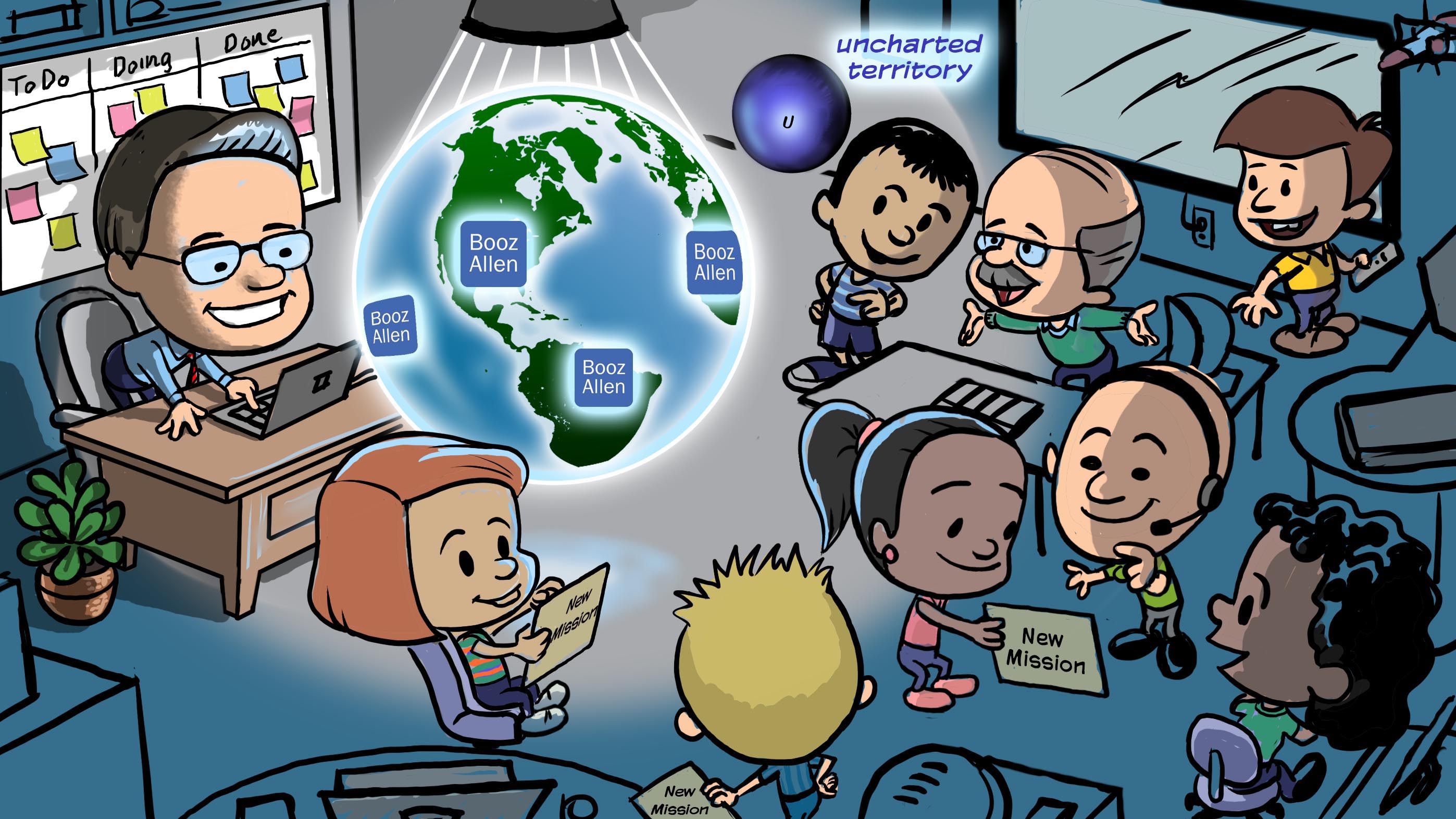
Here’s the first scene again – with the exact same script – rendered in the Calvin & Hobbes style:

Now THAT’s memorable!
Just using a different art style brings the script to life in a completely new way.
In fact, this style was such a huge hit –they have made dozens of videos since in this style.
This is a perfect example of how the right art style can truly elevate a project.
So, what should you consider when choosing the art style for your project?
Here are 3 things to consider:
- TONE/MOOD:
What is the tone of your script – what feelings does the voiceover evoke? And, what do you want the mood to be of your video? Some examples might by light-hearted and humorous. Other scripts are heavy, covering more serious subject matter. Or, maybe you just want an approachable, informational tone. For example, this video we made for Volunteers of America was designed to be beautiful, moving and inspiring. Using our YPaint style, the images are digitally revealed and we incorporated an animated fine line connecting them to support this vision:
- ELEMENT OF SURPRISE:
Now, just because your tone and mood are serious – doesn’t mean your art style has to be! By using an unexpected pairing, you create the element of surprise! Examples of this could be the Booz Allen video – which pairs a fun, youthful art style with serious internal subject matter. Or, take a look at this video for the marketing company, Ribyt. They used color to create an element of surprise, by staying all B&W except for their brands green.
Another way to create an element of surprise is to use a mixed-media approach, by combining different types of video footage. In this case, Vital Smarts used a mixture of live video and whiteboard animation:
- AUDIENCE:
Sometimes the right art style is the one that will appeal most to your audience.
Ask yourself, “What would my target consumer want to see?”
After all, you’re making this video for them, right?
That’s exactly what our client, Wilson Electronics, had in mind when we created this short, one-scene video in our Cartoony style to capture the feeling that people have when they realize their cell phone signal hasn’t been working:
BOTTOM LINE:
Be willing to think outside the box when choosing an artist!
The right art style will pair perfectly with your script and grab the attention of your audience.
We love working with our clients to discuss options, send samples, and help guide you to choosing the perfect art style for your project.
