by Jace Vernon | May 13, 2013 | Animated Whiteboard Videos, Creative Marketing, Marketing, Memory, Video Marketing, video online marketing, Video Scribing, Whiteboard animation, Whiteboard Video, Writing a Script, Ydraw
Writing whiteboard video scripts using Ethos, Pathos and Logos
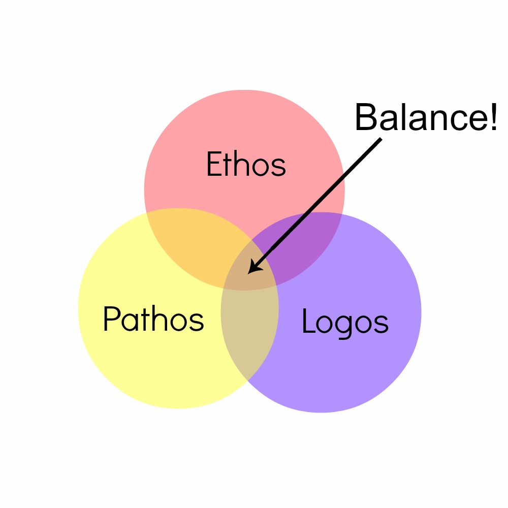
When you sit down to begin writing the script for your online marketing video, you want to keep three little words in your mind: Ethos, Pathos, and Logos. These are the modes of persuasion. When trying to persuade somebody to do something – say, buy your product – you need to make sure we sound credible, appeal to the emotions, and prove certain truths about our company and product. If you’re a good marketer, you’ve obviously lived by the E.P.L mantra, but with whiteboard animation things can be a little different. Here’s some information on how using ethos, pathos and logos in a whiteboard video can work for you:
Ethos is the integrity of the presenter. It is how qualified the presenter appears to be to the audience. When writing a script for a marketing video such as a whiteboard animation video, you have to rely more heavily on everything other than body language or presence to get your message across. If you’re trying to sell something, have an image of the CEO telling viewers all about the company. Write a part with some testimonials. Whoever your main character is, make sure they look the part, and that the audience can tell they are a notable figure and have vested interest in the company or product.
Pathos is triggering emotions. In your whiteboard video, throw in a metaphor or simile, or deliver your message powerfully and passionately. Make the audience feel something, whether it is sadness for the characters who don’t have your product, joy for the characters who do, or excitement at the prospect of purchasing your product themselves. Pathos may also be used to provoke fear in order to sway viewers – but it is always better for whiteboard videos to focus on the fun, positive aspects. Try to play on viewers’ hopes and dreams by describing how their life could be when they follow the call to action.

Logos is the logical appeal used when describing facts and figures that support your cause. Logos and ethos are sort of related – in the sense that using logos can strengthen your ethos by making you look even more knowledgeable on the subject. However, be tasteful in your use of logos when making a whiteboard video – you want your audience to retain information with ease. If you use charts and figures, make sure to incorporate it into the theme of the video, and don’t throw so many statistics at them that they can’t remember why they clicked play.
These are what you need to keep in mind when writing. Ethos, Pathos, and Logos. Thanks Aristotle.
by Ydraw | May 19, 2011 | Creative Marketing, Marketing, Presentation
Simplicity is the ultimate sophistication.
More often then not we have the tendency to complicate rather then simplify. We assume that sophistication equals results, brilliance, performance, and intelligence but it doesn’t. More information, more choices, and more products is not better. In fact it is the exact opposite more is actually less and can cause your audience to disengage. “Simplicity is the ultimate sophistication.”
In the book Paradox of Choice, Schwatz did a study that showed when presented with many choices consumers would often times become paralyzed. “Many of us labor under the impression that providing customers with a wide selection of products of a certain type increases customer satisfaction. After all, we think, if we provide them with 200 brands of peanut butter, they are more likely to find a brand that suits their taste. Schwatz cites surveys done in supermarkets that showed the reverse. When customers were presented with a huge selection of brands of a certain item, fewer customers bought the item than when fewer brands were displayed. The wide selection led to a paralysis of choice – the customers could not decide which brand to choose. As a result, they went away without choosing any.
Take this study and move it over to presentations, business plans, and teaching. Too much information can cause confusion and misunderstanding. The audience might forget or miss your point entirely because you have over complicated everything. Here is a simple solution:
Start with the main idea first and build everything around it.
Take a look at this article. The main thing I wanted the audience to get is: We tend to complicate rather than simplify. I want the audience to simplify their presentations, business plans, websites, mission statements, and scripts thus increasing their results. Everything else I write will either build on that point or prove why that point is true.

If you need a video visit ydraw.com
by Ydraw | May 16, 2011 | Creative Marketing, Marketing, Presentation, Presentation Design, Video Scribing
Making an Impression that will Stick
Here is an email I received the other day from an old friend she said:
This picture was found in a camera during cleanup.
This is a fantastic photo!! Amazing that the film was still good – or memory stick.
Either one, this really tells the story. Look at how high that wall of water is!!
½ a second before tsunami
This picture was taken on the banks of Sumatra Island (the height of waves was of approx. 32 m = 105 ft).
It was found saved in a digital camera, after the disaster.
We cannot know for sure, but very likely the one who took the picture is not alive any more (it was just a matter of seconds).
Today we can see the last image he/she saw before ending life on Earth
 When I first saw this picture I was stunned. That would be so crazy to see in real life. Then I looked at the picture closer and realized that it is fake. Come to find out this email has been traveling the globe for years and has been passed around to millions of people who have pass it on to their contacts. It has spread like social media fire.
The original photograph has a date stamp of “12.11.2002” (November 12, 2002). The prankster who launched this hoax apparently removed the date stamp because it would have immediately destroyed the illusion that the photograph was taken during the 2004 tsunami.
That is funny! How is it that something so ludicrous and fake can spread like wildfire yet something that is true and interesting can not seem to make it past the firewalls of your closest friends and family. Although this story is made up there is something about it that people want to spread. Some of you reading this blog might be tempted to copy this picture and post it all over Facebook. Try it and see the responses that pile in. Why stop a good urban legend when there are so many people out there that just want to believe? All joking aside, some ideas are inherently interesting and some are just flat out boring yet it doesn’t need to be that way. It is all in the way we present it. The words to the email above are not what sales. It is the picture! Its the emotions that trigger inside when one looks at this picture. A huge wave that is about to wipe out a city, very interesting. This story will stick and spread. It is our job to show you how your story, your presentation, your ideas can stick and spread. Making impressions with explainer videos is what we do! Your good ideas needs to be presented in a way that will make people spread it.