How To Create The Right Message For You Audience – Moron Monday
Is your website actually communicating the right message to your audience or turning them away? Don’t let yourself fall into the category of those who are doing things incorrectly! We’ve got plenty of tips that will help guide you to the perfect website and make sure you are sending the right message to your audience.
Take a look at this weeks Moron Monday video to learn what you should and shouldn’t be doing when it comes to your website.
If you missed last weeks episode, you can find it HERE! We talked about how to run successful video ads!
VIDEO TRANSCRIPTION
Hey, what’s up guys? I want to welcome you to another session of Moron Monday.
It’s not Monday, we call it Moron Monday because we just show you the different things that morons do in marketing, and especially video marketing.
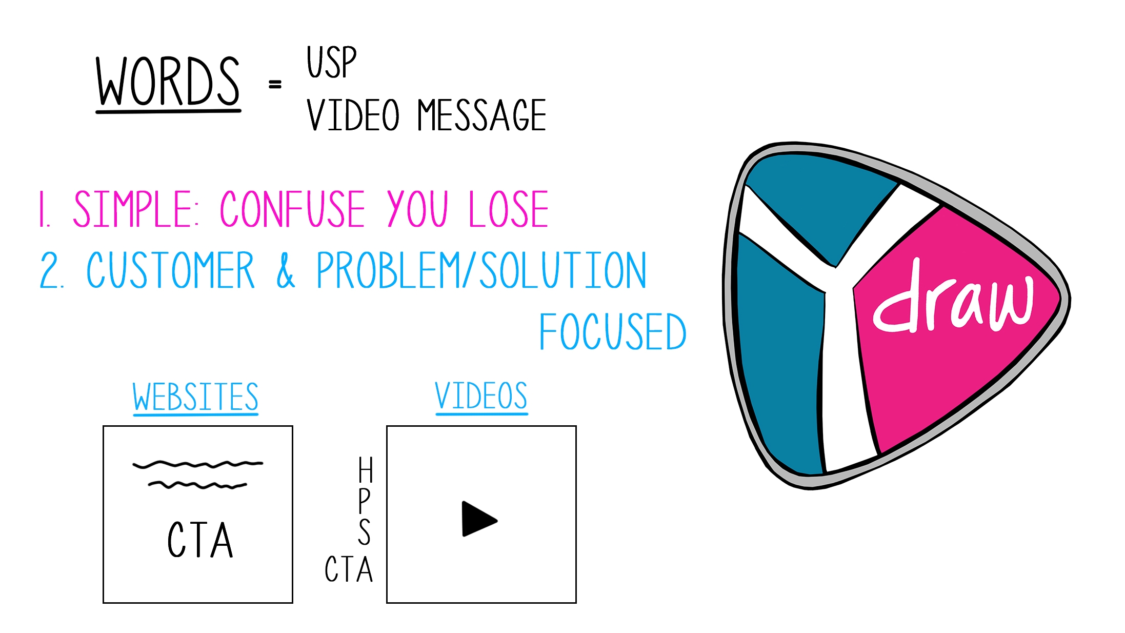
Today is probably one of the most important episodes we’ve had. We’ve only had three, but it’s probably one of the most important episodes you’re going to see and continue to see, because we’re going to talk about the words. The words we use and the messaging we use. If you are a business and you are creating a website or you’re creating a new video, it’s really important that you say the right things to get people to take action.
First off, let’s start with what is a USP?
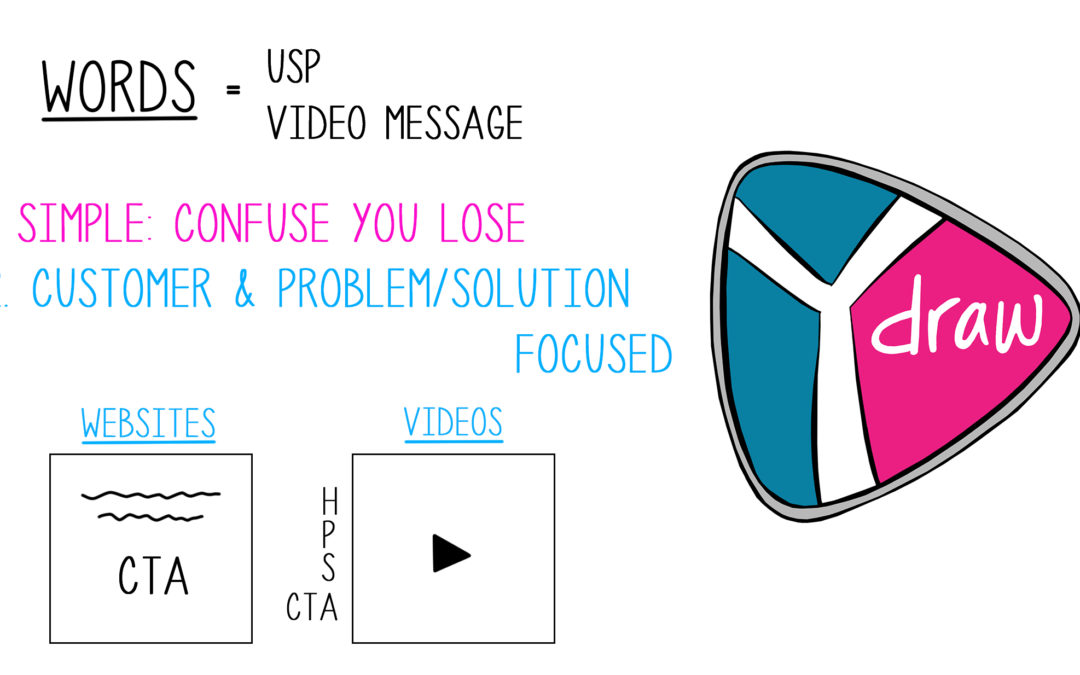
USP is a Unique Selling Proposition.
If somebody comes to your website, they need to know what it is that you do immediately. It needs to pass the five second test.
If you’re creating a video, they need to know “Hey, what is this video about?”. Don’t go into some long old story before you tell them what it’s about. It’s like a trailer.
But you have to have that unique selling proposition and you should take that unique selling proposition across all your platforms.
It needs to be on your social media page, needs to be on your YouTube page, needs to be on your Instagram.
Whatever it is that you are using to get your message in front of people, you need to have your Unique Selling Proposition there.
And then same with your video message, it needs to be in there.
STEP NUMBER 1
This is probably where we see people screw up the most, is with simplicity.
I am a big fan of keeping things simple, and a lot of times when a customer comes to us and they’re like, “Hey, we want you guys to create our script,” (because we do all the scriptwriting when it comes to our videos), most of the time there’s a bit of a clash because what they’re focused on is actually confusing the heck out of the audience.
There’s that knowledge gap where they have been working in that industry, they know everything about it, and then you have a consumer who knows nothing about it.
What happens is they try to take all their jargon, all of their message, all of their features, and they just cram it into a video, and usually it doesn’t turn out good and it confuses the audience.
What we try to do is get them to step back and say, “Hey, let’s keep things simple and do not confuse.” Because if you confuse your audience, you’re going to lose them. They’re going to jump over to somebody else who doesn’t confuse them.
STEP NUMBER 2
And then the next thing, everything that you do needs to be customer and problem-solution focused.
Don’t go out there and say we, we, we, we, we.
You need to talk about what it is that you’re going to do for them.
How can you solve their problem? Because people really don’t care about your awards, they don’t care about that kind of stuff.
Now, you do need to show social proof, I’m not saying go get rid of all your awards, go get rid of all your testimonials. No. That comes a little later, like if you’re creating a website, social proof should be down below.
But you don’t want to start off with “we’re the number one lawyer in the world”. And I’m going to show you some examples of different sites.
I’m going to jump over to a simple screencast and give you guys an idea of what to do and what not to do on what makes sense.
So the very first site we’re going to go jump into is a lawyer site.
Lawyers are actually notorious for confusing their audience, and they love cramming so much information on above the fold.
It just doesn’t make sense. And people don’t pay attention to it anyway.
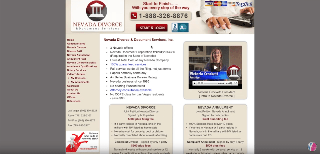
So the very first one I pulled up was this NevadaDivorce.net. And you will see above the fold, which above the fold is above the crease, you have a bunch of call to actions.
You have a ton of paragraphs. You have no idea what it is that these guys do, I mean they’re divorce attorneys, but it just says Nevada divorce and document service.
Now they have some bullet points, they have a whole paragraph here, paragraph there, and bunch of links on the right, call us … You just don’t know what it is that they actually do here, so most people will bounce.
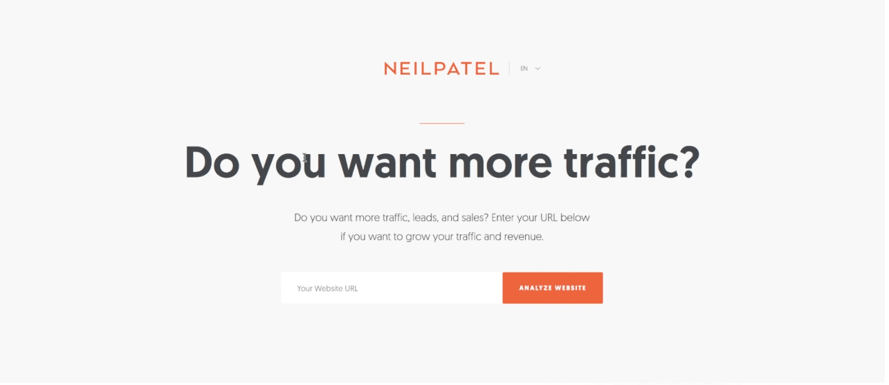
Compare that to this. Neil Patel. If you don’t know who Neil Patel is, he’s one of the SEO experts out there. He ranks for a lot of different things.
But on his website he just says “Do you want more traffic?”
Great. You come there and you’re like, “Oh, what it is that Neil does? He gets me more traffic.” Do you want more traffic lead sales? Enter your URL below if you want to grow your traffic and revenue.
And then he has a website. Now, what he’ll do with this website is more of a lead capture. You put your information in here, and that’s it. That’s what his whole website is set up to do.
It’s simple, effective, and I like to use some of his stuff.
Here’s another attorney. I just kind of make fun of attorneys, sorry. But their websites are usually the worst.
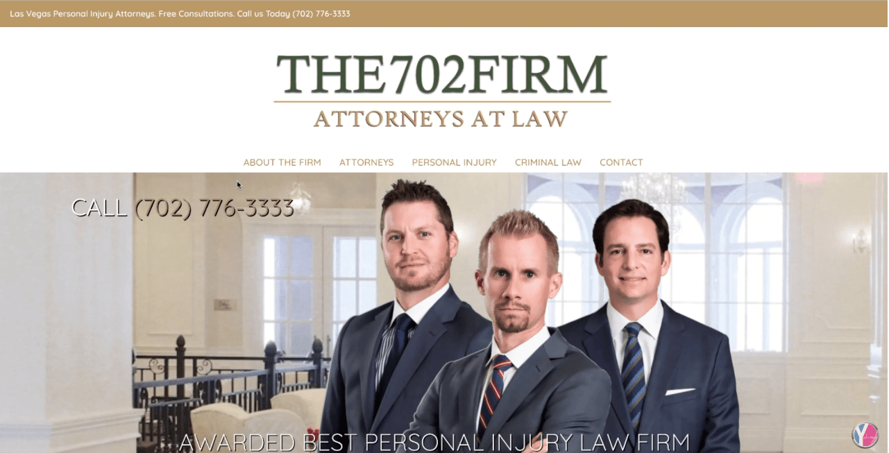
So they start off, here’s my number. They’re the 702 Firm.
Now, you have a smiley, a mean, a half-smile guy here, and they’re awarded the best personal injury law firm. That is a hundred percent me, me-focused, it is not consumer-focused.
Best injury lawyers in Las Vegas…personal injuries…
They’re trying to do a lot of stuff with search engine optimization and load it in here, but this whole website does not talk one bit about the consumer.
Compared to this. This is StoryBrand.
If you don’t know who he is, he actually writes about clarifying your message. So workshops to help you clarify your message, that’s what he does.
He does workshops to help clarify message. And then he just says eliminate confusion, connect with customers, grow your company.
You can see that that is customer-focused and it’s not about him, he doesn’t say, “We do this, this, this, this,” it’s like no, you’re going to eliminate confusion, you’re going to connect with your audience, and grow your company.
And then in the background he actually shows a good image of what’s going on so there’s just no confusion.
Compared to this one, this is a mortgage one. So hundreds of mortgage options under one roof.
Then they have this slider here that is going way too fast. They have nothing here, they just have some images and then this creepy little thing that pops up.
And then if you scroll down, there’s this long old paragraph here that nobody reads.
If you looked at the bounce rate and just said, “Hey, what happened?”
Now, if you space it out it’s okay to do some paragraphs. I’ll show you what I’m testing right now.
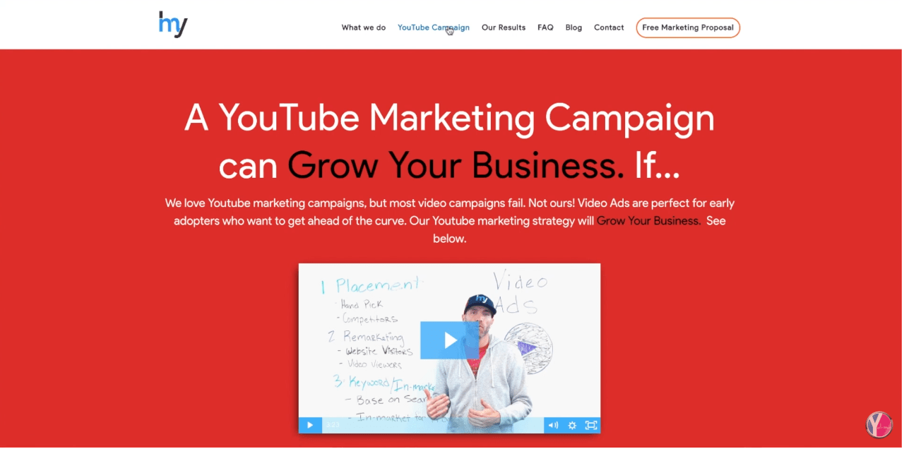
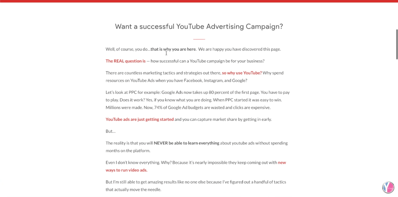
Okay, if you jump over onto this page here. I’m testing some longer form because long form sales letters do work.
It doesn’t all need to be simple, but if you hit the website, a YouTube Campaign can grow your business.
People hit my website, they know what it is on this page. We create YouTube campaigns.
Then I go into these long form paragraphs here, where I talk about what kind of results we get for customers, and this seems to be working.
But you’ll see I space it out. I very rarely have two sentences per paragraph. I space it out, I highlight it. I don’t make it look all slammed together where people aren’t going to read that stuff.
You don’t need to eliminate all the writing on a website. This seems to be working, and we’ll keep testing.
But the main point it, just don’t confuse your audience.
Keep things simple, don’t confuse them.
Go back through your material.
The best way to get the most out of these courses that we do is go back through your material and apply these things that we talk about. Look at your website messaging and say, “Am I confusing my audience? If they come here, do they know what it is that I do within five seconds?”
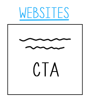
And then another big thing, on a website you should have your headline. You can have a sub-headline here.
Make sure you have a call to action. You want to say, “Hey, if you’re here at my website, this is what I want you to do. Here’s what you’re going to get.” Don’t forget to put a call to action, and most of those websites that I did show you did not have that.
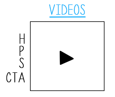
Same with video. So video, it needs to kind of fall in the same format, but it’s a little different.
What we like to do on videos is a headline, problem, solution, call to action, and then we’ll extend it out.
There’s a lot of popular videos that have millions of views that follow this same formula. They will do a guarantee, another solution, another call to action.
But don’t forget this call to action in your videos. You want them to do something. After they engage with any of your material, whether it’s brochures, website, videos, you want to ask them to do something so that you can do business. So don’t forget that.
And that is it. Go through your stuff, make the changes, and we’ll see you on the next episode.
See you. Peace.
Subscribe to our channel.


