by Ydraw | Jun 9, 2011 | Creative Marketing, Memory, Video Scribing

How Mnemonic Devices Can Create Marketing to be Remembered
Mnemonic is another word for memory tool. Mnemonics are techniques for remembering information. The whole idea behind using mnemonics is to using unique ways to encode information so that it is easy to recall when needed. The best way to accomplish this task is to be creative, use vivid mental images, use video scribing, or involve other senses.
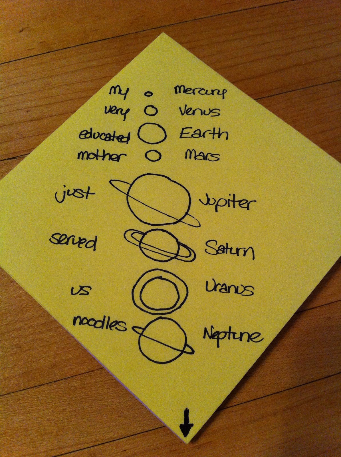
Mnemonics make the information more meaningful to a person by using associations or creating a pattern. Often times, if the information is a list, the first letter of each item on the list will be attributed to a word that is then put into a sentence. An example of this would be the planets in the solar system:

Or, for example, take the colors, where you take the first letter of the word and create a name instead of a sentence.

Mnemonics help to organize the information in a way that is easier for your brain to retrieve it. The best kind of mnemonics are ones that create a visualization of what you’re trying to remember. Visual stimuli are much easier to retrieve than abstract words. The more vivid or abstract the image is, the easier it will be to recall.
Here are a couple of steps that will help when you are marketing or advertising.
1. Use positive images and not negative ones. With so much negativity in the world today our brains tend to hold positive information better.
2. Use vivid color and graphics. Involve as many senses as possible.
3. Exaggerate the important parts of your message.
4. Use humor. People like to laugh and smile.
When creating a video scribe or a presentation use these steps. Be creative and your message will be remembered. Let us know if you have any questions about how to create mnemonic devices or how they can be useful to your marketing approach.
Video Scribing
by Ydraw | Jun 6, 2011 | Creative Marketing, Video Scribing
Let’s talk infographics. You might be asking, what is an infographic? Well, keep reading and I’ll tell you of course! An infographic is a visual representation of information or data. Think of them as very informative, very detailed pie charts or bar graphs, but funner.
Infographics make boring ol’ stats more appealing to read. They add color and images to the information that you are trying to deliver. They are more attention grabbing than just a sheet of paper or a slide with a bunch of information printed on it. It draws the viewer in to the information. It causes their eyes to search the whole image or paper to make sure they have read all the information that it provided. And it can do all of this while showing valuable information. It’s much easier for a person’s brain to understand what’s happening if you show them a visual example as well as facts, an infographic does just that, without causing boredom either!
Infographics are also much more memorable and therefore persuasive. What would you rather see, a presentation filled with statistics on a boring slide, or a colorful image representation of those facts? Your attention is going to be driven towards the images much more and you’re going to feel as though that presentation was much better and put together, with the presenter putting in much more time than the other.
So how do infographics translate into video scribes? Well, if you create an infographic it can act as a rough draft for your video. It gives you a good preview of what your video could look like, much like storyboarding would do.
Below is a great way to show why traffics jams happen. Now imagine if you combine this infographic with a video scribe. It would make for a great unforgettable presentation.

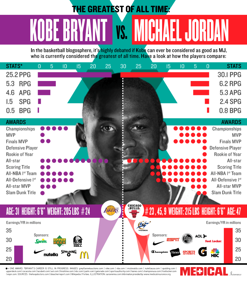
Plus, infographics are just fun. Here you have it. Michael Jordan is far better then Kobe Bryant, but they are both great players. I have always wondered who was better and this infographic was a perfect way to show the stats.
by Ydraw | May 19, 2011 | Creative Marketing, Marketing, Presentation
Simplicity is the ultimate sophistication.
More often then not we have the tendency to complicate rather then simplify. We assume that sophistication equals results, brilliance, performance, and intelligence but it doesn’t. More information, more choices, and more products is not better. In fact it is the exact opposite more is actually less and can cause your audience to disengage. “Simplicity is the ultimate sophistication.”
In the book Paradox of Choice, Schwatz did a study that showed when presented with many choices consumers would often times become paralyzed. “Many of us labor under the impression that providing customers with a wide selection of products of a certain type increases customer satisfaction. After all, we think, if we provide them with 200 brands of peanut butter, they are more likely to find a brand that suits their taste. Schwatz cites surveys done in supermarkets that showed the reverse. When customers were presented with a huge selection of brands of a certain item, fewer customers bought the item than when fewer brands were displayed. The wide selection led to a paralysis of choice – the customers could not decide which brand to choose. As a result, they went away without choosing any.
Take this study and move it over to presentations, business plans, and teaching. Too much information can cause confusion and misunderstanding. The audience might forget or miss your point entirely because you have over complicated everything. Here is a simple solution:
Start with the main idea first and build everything around it.
Take a look at this article. The main thing I wanted the audience to get is: We tend to complicate rather than simplify. I want the audience to simplify their presentations, business plans, websites, mission statements, and scripts thus increasing their results. Everything else I write will either build on that point or prove why that point is true.

If you need a video visit ydraw.com
by Ydraw | May 16, 2011 | Creative Marketing, Marketing, Presentation, Presentation Design, Video Scribing
Making an Impression that will Stick
Here is an email I received the other day from an old friend she said:
This picture was found in a camera during cleanup.
This is a fantastic photo!! Amazing that the film was still good – or memory stick.
Either one, this really tells the story. Look at how high that wall of water is!!
½ a second before tsunami
This picture was taken on the banks of Sumatra Island (the height of waves was of approx. 32 m = 105 ft).
It was found saved in a digital camera, after the disaster.
We cannot know for sure, but very likely the one who took the picture is not alive any more (it was just a matter of seconds).
Today we can see the last image he/she saw before ending life on Earth
 When I first saw this picture I was stunned. That would be so crazy to see in real life. Then I looked at the picture closer and realized that it is fake. Come to find out this email has been traveling the globe for years and has been passed around to millions of people who have pass it on to their contacts. It has spread like social media fire.
The original photograph has a date stamp of “12.11.2002” (November 12, 2002). The prankster who launched this hoax apparently removed the date stamp because it would have immediately destroyed the illusion that the photograph was taken during the 2004 tsunami.
That is funny! How is it that something so ludicrous and fake can spread like wildfire yet something that is true and interesting can not seem to make it past the firewalls of your closest friends and family. Although this story is made up there is something about it that people want to spread. Some of you reading this blog might be tempted to copy this picture and post it all over Facebook. Try it and see the responses that pile in. Why stop a good urban legend when there are so many people out there that just want to believe? All joking aside, some ideas are inherently interesting and some are just flat out boring yet it doesn’t need to be that way. It is all in the way we present it. The words to the email above are not what sales. It is the picture! Its the emotions that trigger inside when one looks at this picture. A huge wave that is about to wipe out a city, very interesting. This story will stick and spread. It is our job to show you how your story, your presentation, your ideas can stick and spread. Making impressions with explainer videos is what we do! Your good ideas needs to be presented in a way that will make people spread it.